
Case Study: Website
.png)
Beacon Logistics is an international freight forwarding company operating across the U.S. and India.
When they came to Carrot, they already had a strong presence in the market but needed to refresh their brand for the U.S. division. We started by refining their brand identity. From there, it was clear their website wasn’t keeping up. It lacked clarity, structure, and a user journey that could effectively turn visitors into customers.
main goal
Design and develop a new website with a clear offer, improved navigation, and a visual direction aligned with their rebrand.
.png)
.png)

01
Audit & Research
We reviewed the existing website from the perspective of a potential client, focusing on four key questions:
-
What do you do, and who is it for?
-
Why should I trust you over others?
-
How does it work, and what results will I get?
-
What’s the next step to get started?
problems identified
Core services were visible, but the messaging within each page was long, unclear, and difficult to scan.
The tone lacked consistency and professionalism, with noticeable grammar issues affecting credibility.
The design (based on their old branding) signaled a company that was behind the times. This impacted trust directly: dated visuals and poor UX often suggest inefficiency and lack of customer focus.
02
Planning
Restructure all website content into a clear architecture.
Rewrite each page with concise, conversion-focused messaging.
Develop wireframes prioritizing usability and clarity.
Define a visual direction aligned with the new brand identity.
03
Execution
With a clear strategy in place, execution focused on translating clarity into the user experience.
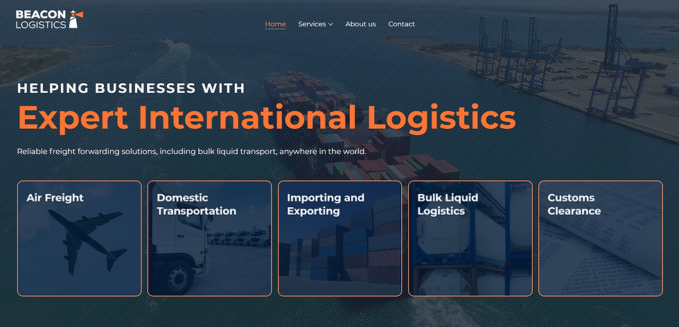
A clear hero title that immediately communicates what Beacon does and who it serves.

.png)
Simplified service pages with structured, easy-to-scan content.
Stronger value proposition messaging across the site.


A modern, cohesive design aligned with the rebrand, improving perceived credibility and usability.
THE results
A fully responsive website with improved UX and UI.
60%+ of traffic coming from organic search, indicating strong visibility.
2m 24s average session duration, reflecting solid engagement.
Consistent inbound inquiries from qualified prospects via contact forms.